Pantone Matching System in Printing

17 January 2025

Share this article

The Pantone Matching System (PMS) ensures accurate and consistent color reproduction across different materials and locations. It assigns unique alphanumeric codes to colors, making it a universal standard for brands and printers worldwide. PMS is critical for maintaining brand identity, reducing color errors, and offering a broader color range than traditional CMYK printing.

Key points about PMS:

Quick Comparison: PMS vs. CMYK

PMS is the go-to choice when exact color consistency is essential, while CMYK is better suited for detailed, full-color designs. Keep reading to learn how PMS works and why it’s a cornerstone of professional printing.

CMYK vs Pantone vs RGB – What’s the difference?

A flat-lay view of various Pantone color guides, fabric swatches, and a color-matching device on a neutral background.

How the Pantone Matching System Works

The Pantone Matching System (PMS) provides a structured way to identify and reproduce colors with accuracy and consistency.

Understanding PMS Codes

Every Pantone color is labeled with a unique alphanumeric code (e.g., PMS 300 C). The number indicates the color, while the letter specifies the type of paper – C for coated [3] . This universal system allows designers, manufacturers, and printers to communicate color choices without confusion.

With a library of over 1,000 colors, including metallic and fluorescent options [1] , the system ensures precision. Tools like light boxes are often used to check colors under consistent lighting conditions.

How Pantone Colors Are Reproduced in Print

Printing Pantone colors relies on exact ink formulas provided by Pantone [3] . This precision is critical for professional print shops, such as Miro Printing & Graphics Inc., to meet specific client requirements.

The process involves two key steps:

Achieving Consistency Across Different Materials

PMS ensures uniform color reproduction across a variety of materials [3] . Specialized color palettes are designed for specific substrates, as shown below:

These palettes are tailored to their respective materials, ensuring that a brand’s colors remain consistent no matter where they’re applied [5] . This system is essential for maintaining brand identity across diverse projects and materials.

Advantages of Using the Pantone Matching System

The Pantone Matching System (PMS) offers a range of benefits that make it a go-to tool in the printing industry. Here’s why PMS stands out for color management.

Ensuring Brand Uniformity

PMS provides a universal color standard that keeps brand colors consistent across all materials [3] [5] . For example, when companies like Miro Printing & Graphics Inc. handle multiple projects for a client, PMS ensures that the same brand colors appear on everything – whether it’s business cards, banners, or packaging.

Achieving Precise Color Reproduction

PMS reduces mismatches between design concepts and final prints by using a standardized system [4] [7] . The system relies on specific ink formulas, controlled quality checks, and detailed material guidelines to deliver consistent results.

This level of precision helps avoid expensive reprints and ensures client satisfaction, especially when working with corporate materials where accuracy is crucial.

Offering a Broader Color Range

PMS goes beyond the limitations of traditional CMYK printing by providing a wider selection of colors [3] [5] . This includes:

These features make PMS a vital tool for professional printing, offering capabilities that CMYK systems simply can’t match.

sbb-itb-ce53437

Comparing Pantone Matching System and CMYK Printing

Color Accuracy and Brightness

PMS and CMYK handle color reproduction in very different ways. CMYK relies on four inks – cyan, magenta, yellow, and black – to create a wide range of colors, while PMS uses pre-mixed inks for exact shades [1] [9] . This makes PMS a go-to choice for businesses that need precise color consistency, especially for corporate branding.

One key difference is consistency. CMYK can show variations across print runs, with a typical color shift of 5-10% between screen and print [10] . On the other hand, PMS delivers uniform results thanks to its standardized mixing methods, offering over 1,867 spot colors [2] .

Cost and Efficiency Comparison

Choosing between PMS and CMYK often comes down to the project’s requirements and budget. Print shops like Miro Printing & Graphics Inc. suggest PMS for materials where exact color matching is critical, such as logos and corporate branding. CMYK, however, is often the better option for designs with intricate gradients or photographic elements, as it tends to be more cost-effective [9] .

PMS is ideal for projects where exact color accuracy is non-negotiable, while CMYK shines in designs with complex visuals. However, CMYK may require extra quality checks to ensure the final product meets expectations [2] [11] . Knowing these differences allows businesses to pick the method that aligns best with their goals, whether it’s for branding or custom prints.

Applications of the Pantone Matching System

PMS in Custom Printing Services

Print shops use the Pantone Matching System (PMS) to achieve precise color consistency across a wide range of printing projects. For example, companies like Miro Printing & Graphics Inc. rely on PMS to ensure that brand colors remain uniform across items like business cards, brochures, banners, and packaging – no matter the material or scale.

PMS’s standardized ink formulas allow for the creation of over 1,867 colors, ensuring exact matches for custom printing needs [2] . This level of accuracy is essential for corporate materials where maintaining brand consistency is critical.

Additionally, PMS supports global branding efforts by enabling consistent color communication across different markets, making it a key tool for companies with an international presence.

PMS in Branding and Design

PMS acts as a universal color language for designers and printers, ensuring brand colors remain consistent worldwide. Its standardized codes eliminate confusion, allowing brands to maintain recognition across all forms of marketing materials.

PMS is also widely used in industries like fashion, textiles, plastics, and paint manufacturing [8] . Designers often turn to PMS for colors – such as metallics and fluorescents – that cannot be reproduced using CMYK.

Conclusion

The Pantone Matching System (PMS) plays a key role in professional printing and branding, offering unmatched precision and consistency.

With a library of 2,161 solid colors created from 14 base inks, PMS ensures accurate color reproduction. Its unique codes for coated, matte, and uncoated paper stocks guarantee consistent results across different surfaces [6] .

One of PMS’s standout features is its ability to create specialty colors like metallics and fluorescents – options that go beyond what CMYK printing can achieve [5] [12] . This expanded palette allows designers and print shops to meet complex printing demands while maintaining precise color matching.

Thanks to its global standardization, PMS has become a trusted tool for ensuring brand consistency across the world. Businesses and print shops, including Miro Printing & Graphics Inc., rely on PMS for dependable results on a variety of materials.

For the best results, experts suggest using a light box to compare printed materials with Pantone swatches under consistent lighting conditions [6] . This attention to detail solidifies PMS’s reputation as the leading choice in professional printing.

Related posts

Recent Posts

A person shows a printed sheet with the word
22 May 2025
Affordable book printing in North Bergen, NJ. Let us bring your vision to life. Contact Miro Printing & Graphics, Inc. today for expert printing services.
A mechanical printer head applying a sheet of reflective gold foil onto a white surface.
19 January 2025
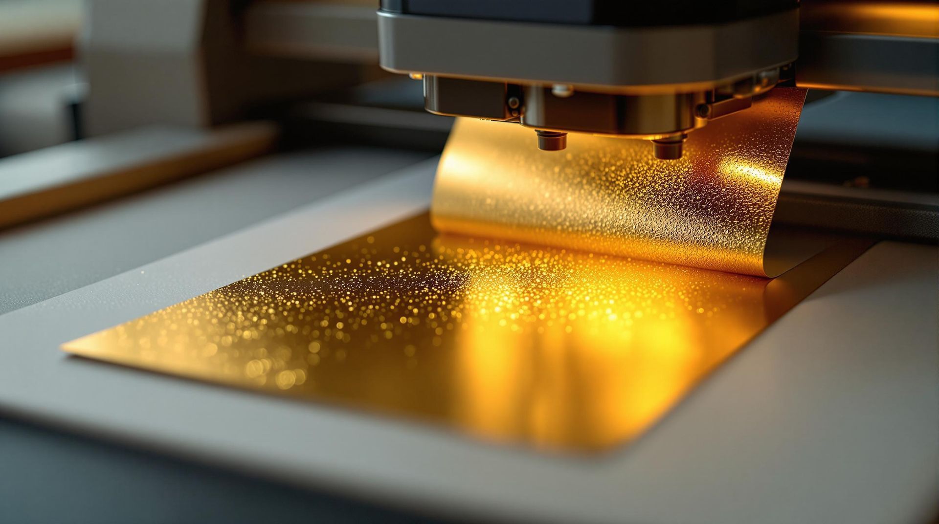
Learn the step-by-step process of foil stamping, a technique that adds elegance and shine to various materials through heat and pressure.
Two overlapping rectangular cards: one with a gold ornate damask pattern on black, the other a textured, matte cream.
19 January 2025
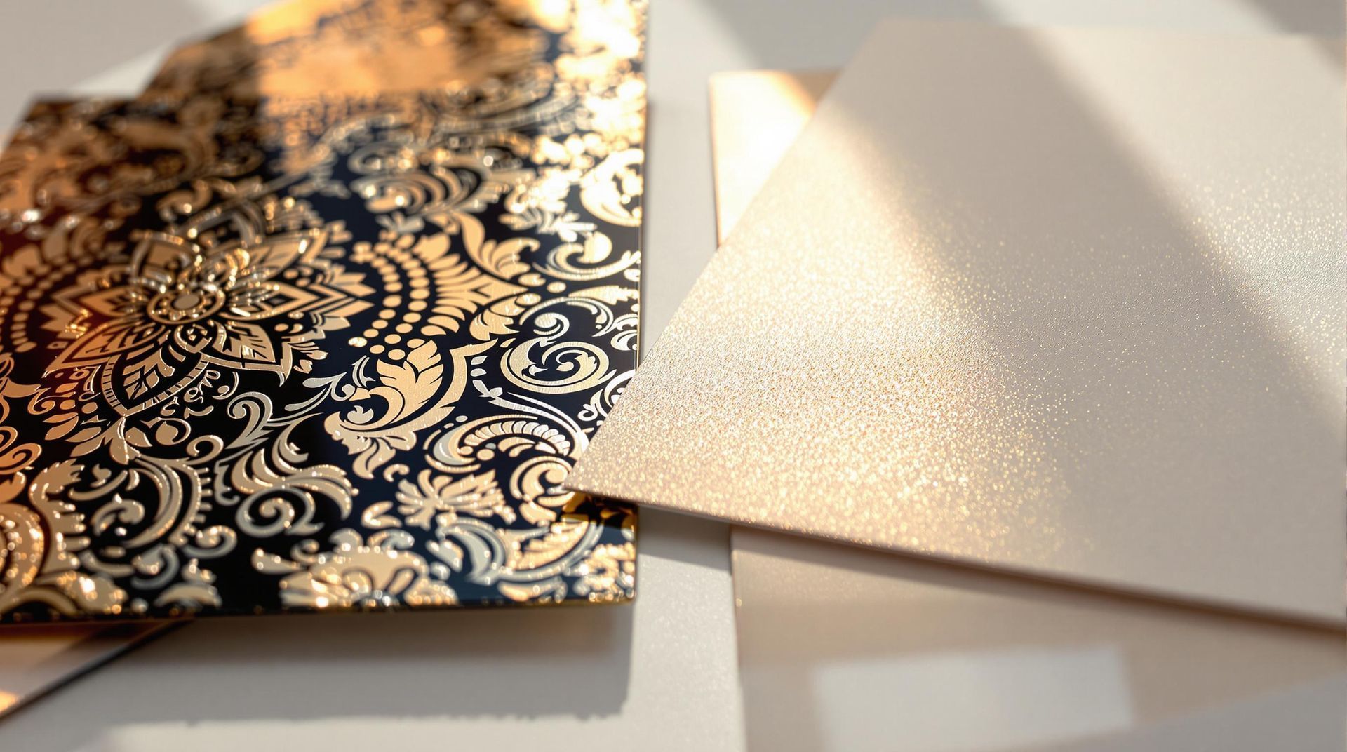
Explore the differences between foil stamping and metallic ink to choose the best metallic finish for your printing projects.
A cluttered wooden desk covered in scattered sheets of paper, stationery, a laptop, and various office supplies.
18 January 2025
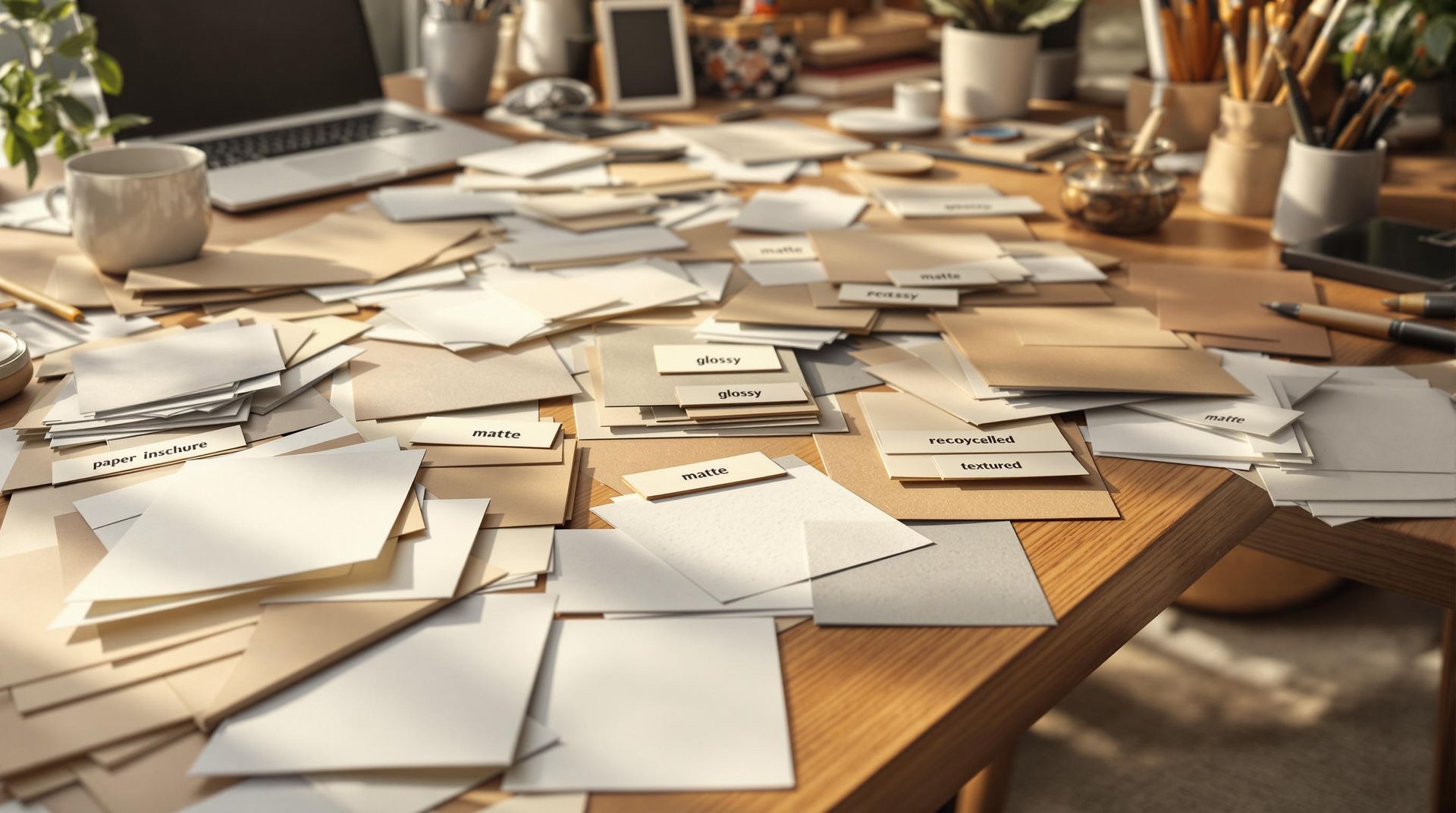
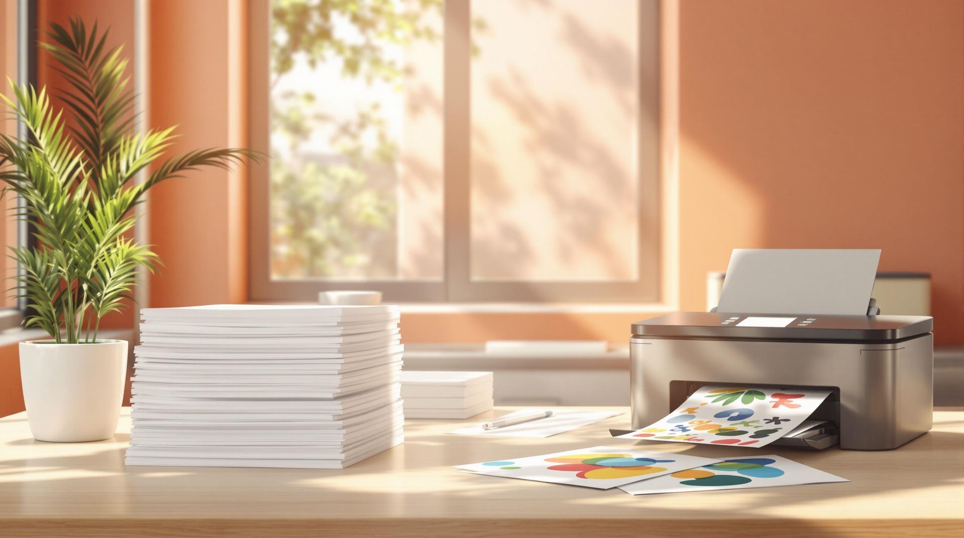
Learn how to choose the right paper for custom prints, considering types, finishes, durability, and project goals for optimal results.
A printer on a desk next to a laptop displaying colorful design samples, with scattered prints and art supplies.
18 January 2025
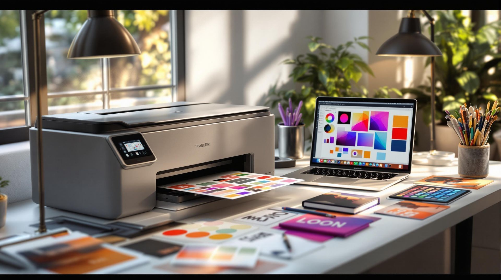
Explore personalized print design, its importance, essential components, and practical steps for creating impactful printed materials.
A worker wearing a light apron and gloves writes on a document at a table in a bright, industrial printing factory.
18 January 2025
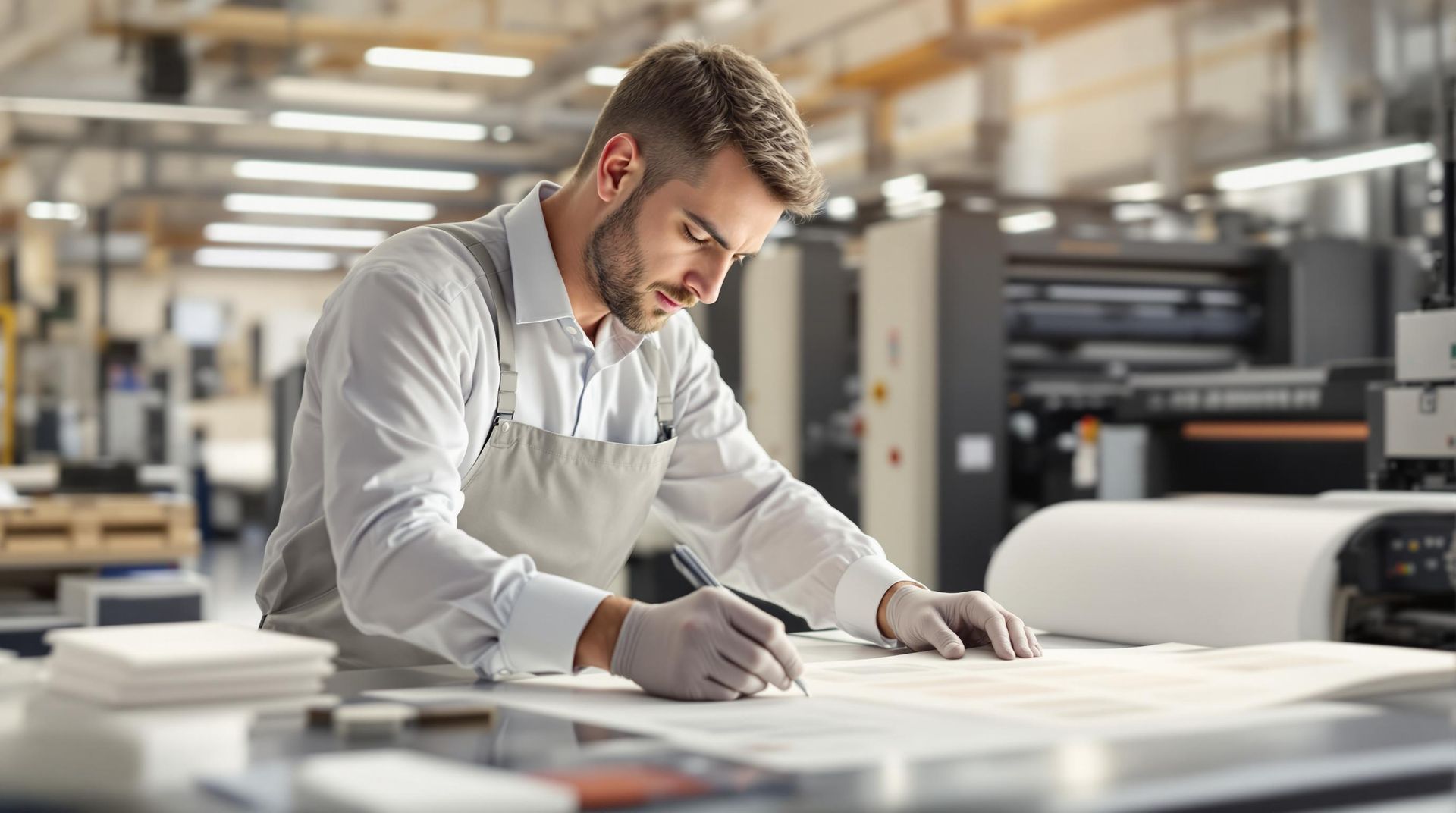
Learn how to effectively identify and address surface coating defects in printing to enhance product quality and customer satisfaction.
A person in a lab coat uses a magnifying glass to inspect a colorful print coming off an industrial printing press.
18 January 2025
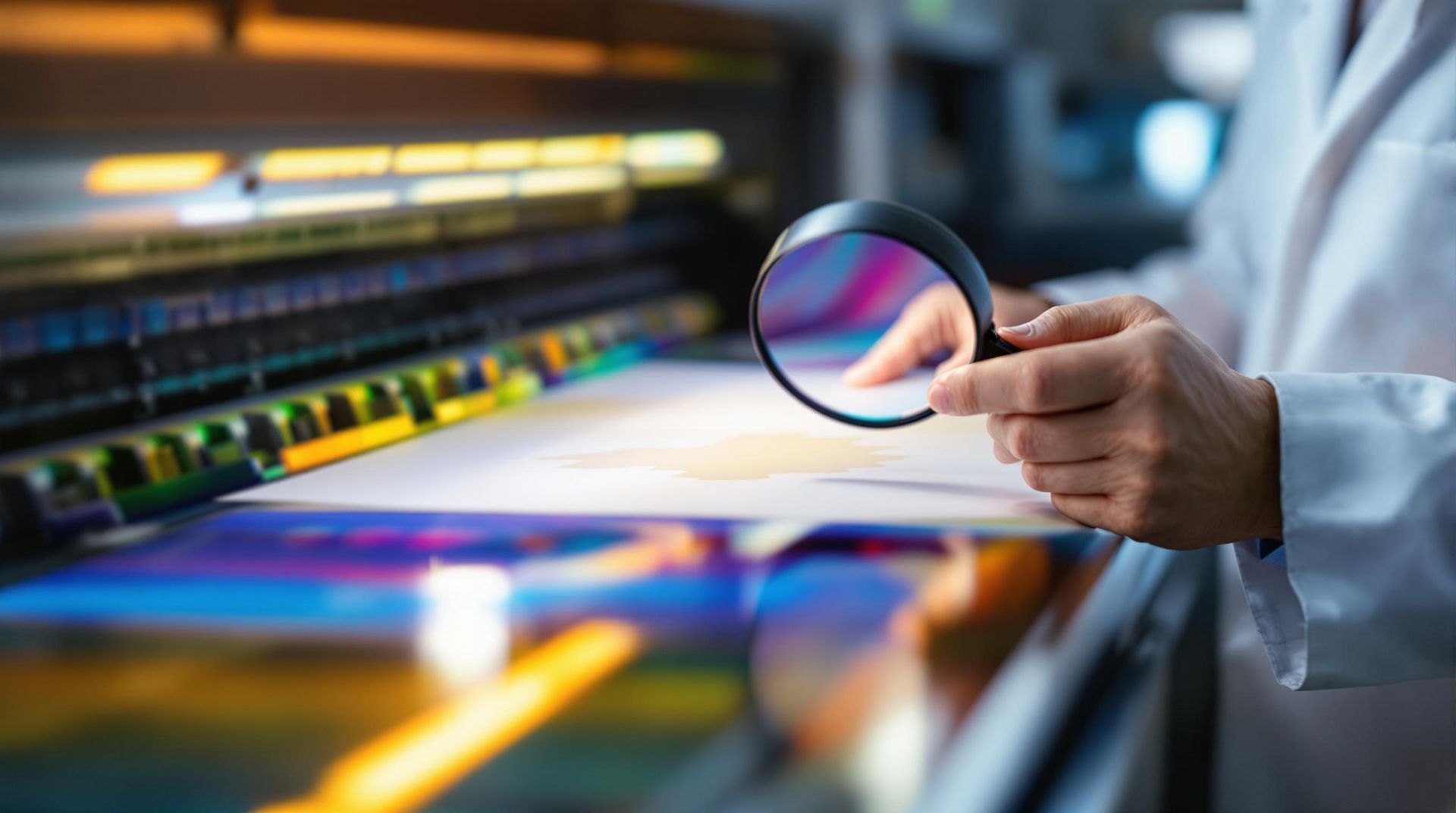
Learn how to troubleshoot and prevent surface coating defects in printing for consistent, high-quality results.
A desk with a stack of white paper, a printer, and a potted plant in front of a window in a sunlit room.
17 January 2025
Explore practical strategies for selecting eco-friendly paper that saves costs and reduces environmental impact through smart printing choices.
A stack of brown recycled paper on the left and white paper on the right, set against a backdrop with soft leaf shadows.
17 January 2025
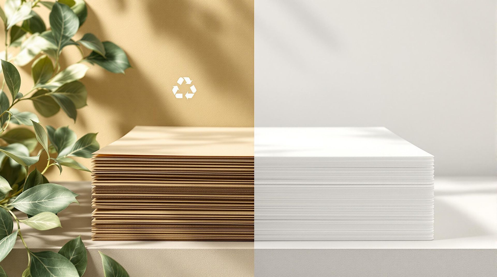
Explore the cost, energy, and environmental impacts of recycled versus virgin paper to make informed choices for your printing projects.
A large printing press in an office, with a split-screen effect showing cool blue tones on the left and warm gold on the right.
17 January 2025
Understand the differences between RGB and CMYK color models to ensure accurate color reproduction in digital and print designs.
Show More